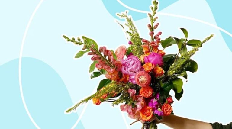
Color is a fundamental element of floral design that has the power to influence mood, convey emotions, and enhance the beauty of floral arrangements. It plays a critical role in how we perceive flowers and can dramatically change the atmosphere of any space. Whether you are designing for a wedding, an event, or simply arranging flowers in your home, understanding the definition of color in floral design and its significance can elevate your arrangements and help you communicate through the language of flowers.
Table of Contents
In this article, we will explore what color means in floral design, how it affects the overall composition, the importance of color harmony, and provide tips for using color effectively in your floral creations. Additionally, we will answer some frequently asked questions to give you a deeper understanding of this essential aspect of floral design.
What is the Definition of Color in Floral Design?
In floral design, color refers to the visual quality of flowers, foliage, and other plant materials used in an arrangement. The colors of these elements can be natural or enhanced through various design techniques. Color is one of the most powerful tools a floral designer has at their disposal because it can instantly evoke certain feelings or set a specific tone.
Colors in floral design are used to:
- Enhance the overall aesthetic: Colors can bring vibrancy, elegance, or subtlety to an arrangement.
- Create emotional impact: Different colors are associated with various emotions, such as warmth, tranquility, or excitement.
- Convey symbolic meanings: Certain flowers and colors hold symbolic significance, often used to express messages of love, celebration, or mourning.
The way colors are combined in a floral arrangement can either complement or contrast with each other, creating different effects depending on the design’s purpose and the desired visual impact.
The Importance of Color in Floral Design
Color is one of the first things that people notice about floral arrangements, and it has the power to make or break a design. Below are some key reasons why color is so important in floral design:
- Sets the Mood: Just like in art or interior design, color has the power to affect how we feel. Bright colors like red, orange, and yellow can evoke feelings of happiness, energy, and excitement, while cooler tones like blue and purple may create a calming and peaceful atmosphere. By understanding how colors interact with human emotions, floral designers can tailor their arrangements to suit the specific mood or ambiance desired for an event or space.
- Affects the Perception of Space: The use of color in floral arrangements can also influence how a space is perceived. For example, lighter colors such as pastels or whites can make a room feel more spacious and airy, while darker, bolder colors like deep reds or purples can create a sense of warmth and intimacy. Designers often choose color palettes based on the size and style of the space they are decorating.
- Creates Visual Balance: In floral design, using color thoughtfully can help create balance within an arrangement. A single dominant color may be used to create a harmonious look, or complementary colors can be blended together to add contrast and visual interest. Understanding color theory—how colors relate to one another—allows designers to manipulate the balance of their creations.
- Adds Meaning and Symbolism: Different colors in floral design are often used to convey specific meanings or emotions. For example, red flowers are often associated with love and passion, while white flowers symbolize purity and innocence. In many cultures, certain flowers and colors are used for specific occasions, such as weddings, funerals, or celebrations, to communicate deeper sentiments.
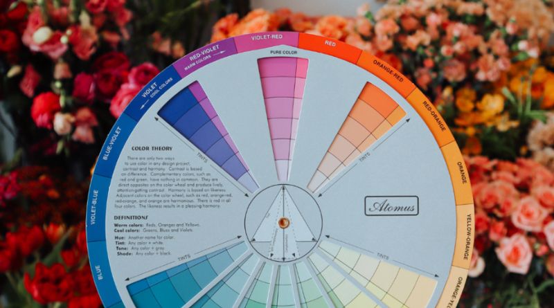
Color Theory in Floral Design
Floral designers typically apply color theory when selecting flowers and creating compositions. Color theory provides a framework for understanding how different colors interact with one another and how they can be used to create balance, contrast, and harmony in a design. Here are the main concepts of color theory that apply to floral design:
- Primary Colors: The primary colors—red, blue, and yellow—are the foundation of color theory. These colors can be mixed to create other colors and are often used as the dominant tones in floral arrangements.
- Secondary Colors: Secondary colors—orange, green, and purple—are created by mixing two primary colors. Secondary colors are commonly used in floral designs for their vibrant and dynamic qualities.
- Complementary Colors: Complementary colors are those that are opposite each other on the color wheel, such as red and green or blue and orange. When placed together, complementary colors create contrast and make each color appear more vibrant. In floral design, complementary colors can create bold, striking arrangements.
- Analogous Colors: Analogous colors are those that sit next to each other on the color wheel, like red, orange, and yellow. These colors blend well together and create a harmonious, cohesive design. Analogous color schemes are often used in floral arrangements to evoke a sense of tranquility and unity.
- Monochromatic Colors: A monochromatic color scheme involves using variations of a single color, such as light pink, dark pink, and rose. This approach creates a subtle, elegant look and is often used in more formal or minimalist floral designs.
- Warm and Cool Colors: Warm colors (red, orange, yellow) tend to evoke feelings of warmth, energy, and passion, while cool colors (blue, green, purple) are calming, serene, and peaceful. A balance of both warm and cool tones can create a dynamic yet harmonious arrangement.
Tips for Using Color in Floral Design
Now that we understand the role of color in floral design, here are some tips for using it effectively:
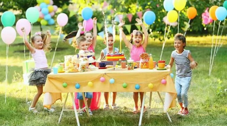
- Consider the Occasion: Think about the purpose of the arrangement. For a wedding, soft pastels like blush pink and ivory are often preferred, while vibrant, bold colors like red and orange are used for celebratory events. For funerals, white, lavender, or soft blue flowers are common choices, symbolizing respect and remembrance.
- Pay Attention to the Setting: Choose colors that complement the environment where the flowers will be placed. If the flowers will be displayed in a bright, modern space, more vibrant, striking colors may work well. For a rustic or vintage setting, muted tones and natural colors may better reflect the ambiance.
- Use Color Contrast: Experiment with contrasting colors to create visual interest. For example, pairing yellow with purple or orange with blue creates a dynamic effect that captures attention. However, be mindful of not overdoing it; too many contrasting colors can create chaos rather than harmony.
- Use Color to Guide the Eye: Color can be used to direct the viewer’s attention to certain areas of an arrangement. A pop of bright color can draw the eye, while muted tones can act as a background. Designers often use color strategically to create focal points or to highlight specific flowers or elements.
- Seasonality: Many flowers are associated with certain seasons, and their colors often reflect that. For example, spring flowers like tulips and daffodils often come in soft pastels, while autumn flowers like chrysanthemums and marigolds are rich in gold, red, and orange hues. Incorporating seasonal flowers into your arrangements can enhance the overall theme and bring a sense of time and place.
Conclusion
In floral design, color is not merely a superficial element; it is a powerful tool that influences emotions, creates balance, and enhances the overall aesthetic of an arrangement. Whether you are a professional designer or someone who enjoys creating floral arrangements as a hobby, understanding how to use color effectively can significantly improve the visual and emotional impact of your designs.
By considering color theory, understanding the symbolism behind colors, and using color thoughtfully to suit the occasion and environment, you can create floral designs that are not only visually stunning but also deeply meaningful.
Frequently Asked Questions (FAQs)
1. How do I choose the right colors for a floral arrangement?
To choose the right colors, consider the occasion, setting, and mood you want to convey. Warm colors like red and orange evoke energy and passion, while cool colors like blue and green create calmness. You can also use complementary or analogous color schemes to achieve harmony or contrast.
2. What is the significance of color in floral design?
Color plays a vital role in floral design as it influences the emotional tone of an arrangement. Different colors have specific meanings: red symbolizes love, yellow represents joy, and white stands for purity, for example. Color also helps set the atmosphere and enhances the overall aesthetic.
3. Can I mix different colors in a floral arrangement?
Yes, mixing different colors can create a vibrant and visually interesting arrangement. However, it’s important to maintain balance by either choosing complementary colors or ensuring that the colors blend well together, using the principles of color theory.
4. What are the best colors for a wedding floral arrangement?
Soft pastels like blush pink, ivory, lavender, and pale blue are commonly used for weddings, as they evoke romance and elegance. However, bold colors like red or gold can also be used for more dramatic effects, depending on the wedding theme.
5. How does color impact the perception of space in floral design?
Lighter colors, like whites and pastels, tend to make a space feel more open and airy, while darker colors, like deep reds or purples, create a more intimate and cozy feeling. The use of color can help transform the overall ambiance of a room.